
Hey Kiddo
A multi-concept neighborhood restaurant.

Brand positioning
Brand name (OK YEAH)
Logo design
Visual identity system
Brand messaging
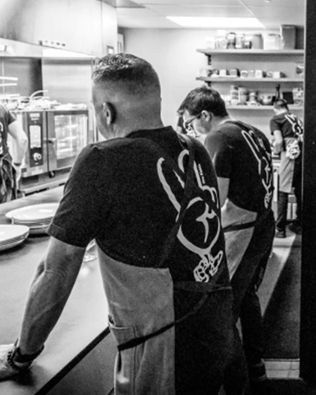
Branded merch
Copywriting
Produced with FYLAMENT, REGULAR Architecture, and Id Est.
Hey Kiddo is a casual neighborhood restaurant in Denver started by Chef Kelly Whitaker and the team at Id Est. Hey Kiddo includes a easygoing restaurant experience, a dynamic rooftop area, and a secluded back bar called OK YEAH.
The identity mixes bold and approachable design elements with an iconic mascot called the Peacewalker.
Let’s talk about how one of Denver’s best chefs and top restaurant groups launched a new neighborhood concept that became an instant classic. Main ingredients: a dynamic strategy, timeless typography, and a high-top-wearing mascot.
How it started.
Chef Kelly Whitaker and the team at Id Est asked for an iconic brand that felt approachable while upholding their hard-earned reputation for thoughtful, curated food experiences.
Once our mutual friends at FYLAMENT made an introduction and Studio Parkside was on the roster, the deadline was fast approaching and the challenge to develop all of the branding within eight weeks was accepted.


One brand for a multi-concept space.
The ask was simple but not singular. We set out to brand the restaurant in a way that cohesively encompassed its many concepts: sit-down contemporary dining, a conversational cocktail experience, local goods for sale in the lobby, and a rooftop bar to boot. Plus, the client needed a new name and logo that suited plans for an intimate mixology bar in the back room. Cheers.
A varietal approach was key. Everything from the architecture to the hours of the restaurant was set up to be a go-to, always-hits spot for the many walks of life strolling down Tennyson Street. Moms and pops, bartenders and baristas, morning tee-timers and late-night on-the-towners.
The space would be open and dynamic, the menu would be select and seasonal. And the brand identity would nail it down, without boxing it in.
This was one of those delicious opportunities to let a brand be inspired by brick and mortar, and the other way around.
Throughout the process, I worked closely with the architects and interior designers on the space to ensure that the overall vibe was vibing and the specs were specific.
Never skip lunch. Or strategy.
When the schedule is tight, it’s especially important that strategy is, too. Fortunately, my full branding process can usually be executed in eight weeks or less.
After a quick-but-thorough Discovery, the Opportunity was outlined and the Brand Framework delivered.
These three robust presentations focused around Hey Kiddo differentiators, visionary brand storytelling, and the key personality traits that would hit home in our target market. Or, in this case, our home neighborhood.


The goal was to give Id Est a diligent deck of inspiration that would not only launch the new brand, but set them up for successful marketing for decades to come.
The result? They loved it. And then the fun stuff could begin. Just kidding. I think strategy just as fun as writing and design.
But it was time to translate this strategic storytelling into a living, breathing, walking, talking brand. Speaking of which, we should talk about the brand mascot, which could be an odd choice for a restaurant without a drive-thru.

Meet the Peacewalker.
Because the best way to make a brand personable? Personify it. Make it iconic? Give it an icon. Nod to the well-known, award-winning Chef behind it all? Borrow his shoes.
The Peacewalker is all about close-knit camaraderie. It’s the down-to-earth street-friendly style. And it became the warm handshake of Hey Kiddo.


A logo that speaks levels.
Hey Kiddo calls its customers up a few floors into the lofty, inviting space. And the rooftop area adds another element of elevation.
The right-alignment in the logo mirrors this stairway to heaven. Classic typography makes the bold statement that this Berkeley staple can be stamped on the sidewalk.
It looks good in black, neon, or embroidery. Like the neighborhood Hey Kiddo lives in, the logo is designed to feel approachable and unfussy.


OK, what’s next?
Good question. Let’s dive deeper into the brand and decide what to call the cozy cocktail bar in the back. A key component of this drink-forward concept was closeness. It was important that there was very little separation between patron and pourer. And the ultimate sign of tight-knit trust? A trust-fall with your drink order.
This is the type of place where you let the bartender make a suggestion. And when the suggestion sounds like exactly what you didn’t even know you wanted, you say: “OK…Yeah.”
The name OK YEAH is light-hearted, nonchalant, and comes with that happy hour feeling of either a long-awaited or last-minute Yes.
This serif wordmark is a weathered counterpart to the Hey Kiddo emblem, with a lowercase side of chill. No rush, no pressure, no problems. No tough decisions, because the energy here is nothing but easy answers. Sometimes all you need to say is “OK, Yeah”.


Welcome to the neighborhood.
Social assets were written and designed, swag was sewn, the Peacewalker was etched into ice cubes, and the strategy-led visual identity came to life through various design files ready for a turnkey restaurant launch.
When the new concept opened, Denver embraced the new community hub with open hearts and satisfied hunger.
In the end, Kelly and the team at Id Est had a brand they were proud to serve on a locally-sourced sustainable platter. And they had all of the materials and inspiration needed to empower them to own and grow Hey Kiddo their way. It’s their dream, after all. I’m just branding it.
“Working with Michael Benjamin is a joyful and rewarding experience from start to finish. His laid-back yet professional demeanor makes working with him a breeze. He does not design for the sake of creating an image; he designs to create an impact.”

Keghan Hurst
FYLAMENT