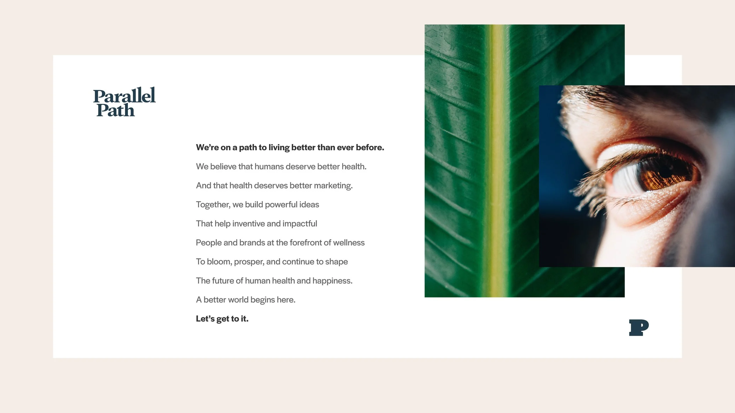
Parallel Path
Talking about health and happiness.
Parallel Path needed a way to turn their complex expertise into something both engaging and easy for their clients to understand. They wanted a sophisticated, clean brand identity to replace their existing look, making it more appealing, professional, and strategically aligned with their target audience.
Brand Positioning
Visual Identity System
Logo Design
Brand Messaging
Copywriting
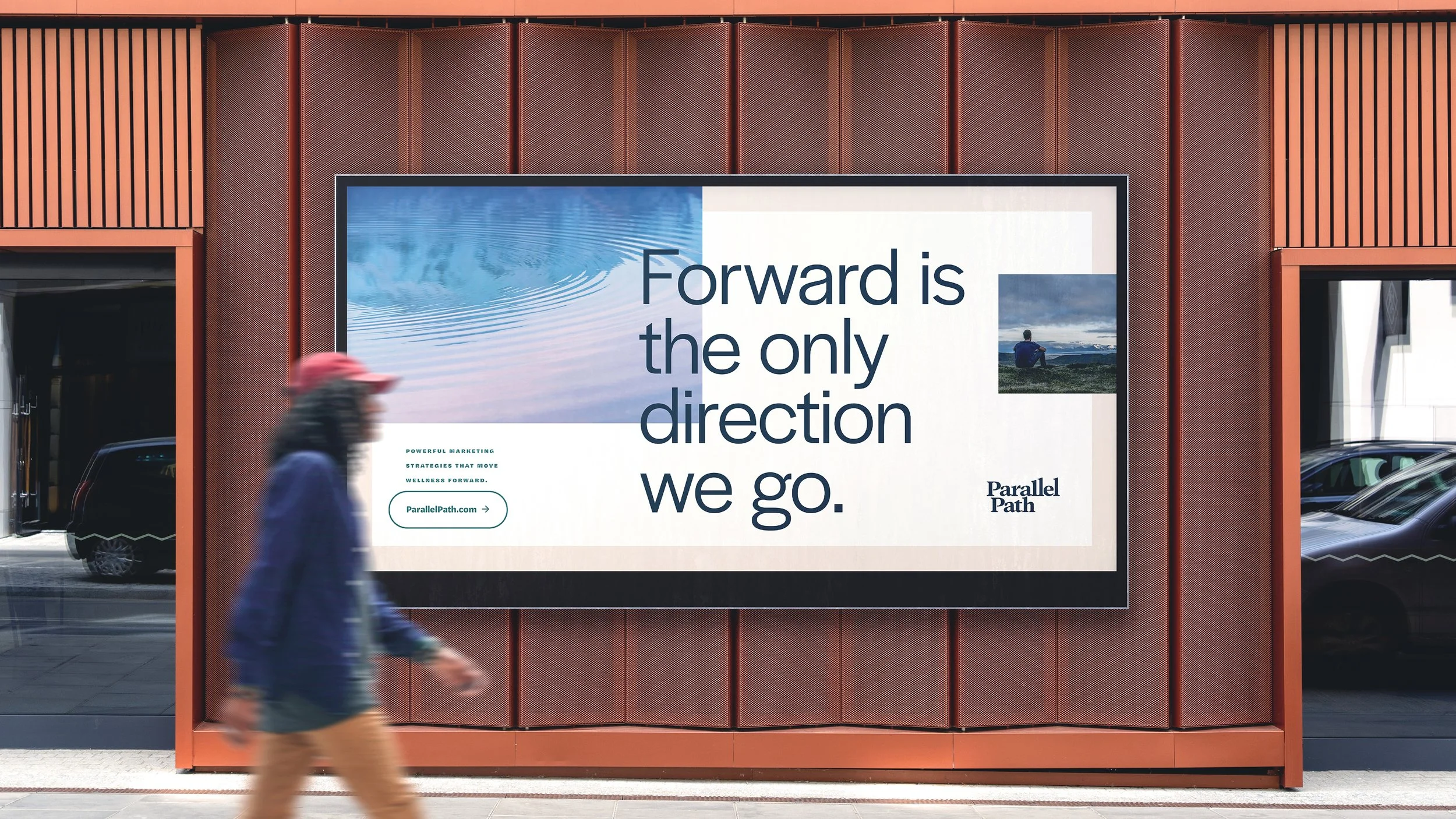
Parallel Path may be in the health field, but they needed more than clean and simple. They are standout experts in the health and wellness space, with a vision to make the world a healthier, happier place. So I delivered a versatile toolkit designed to do the heavy lifting, from attracting elite talent and new clients to keeping their internal team inspired and genuinely engaged. Every single element was built for seamless daily use and long-term scalability, giving Parallel Path a powerful, clear identity that commands attention in a crowded market.
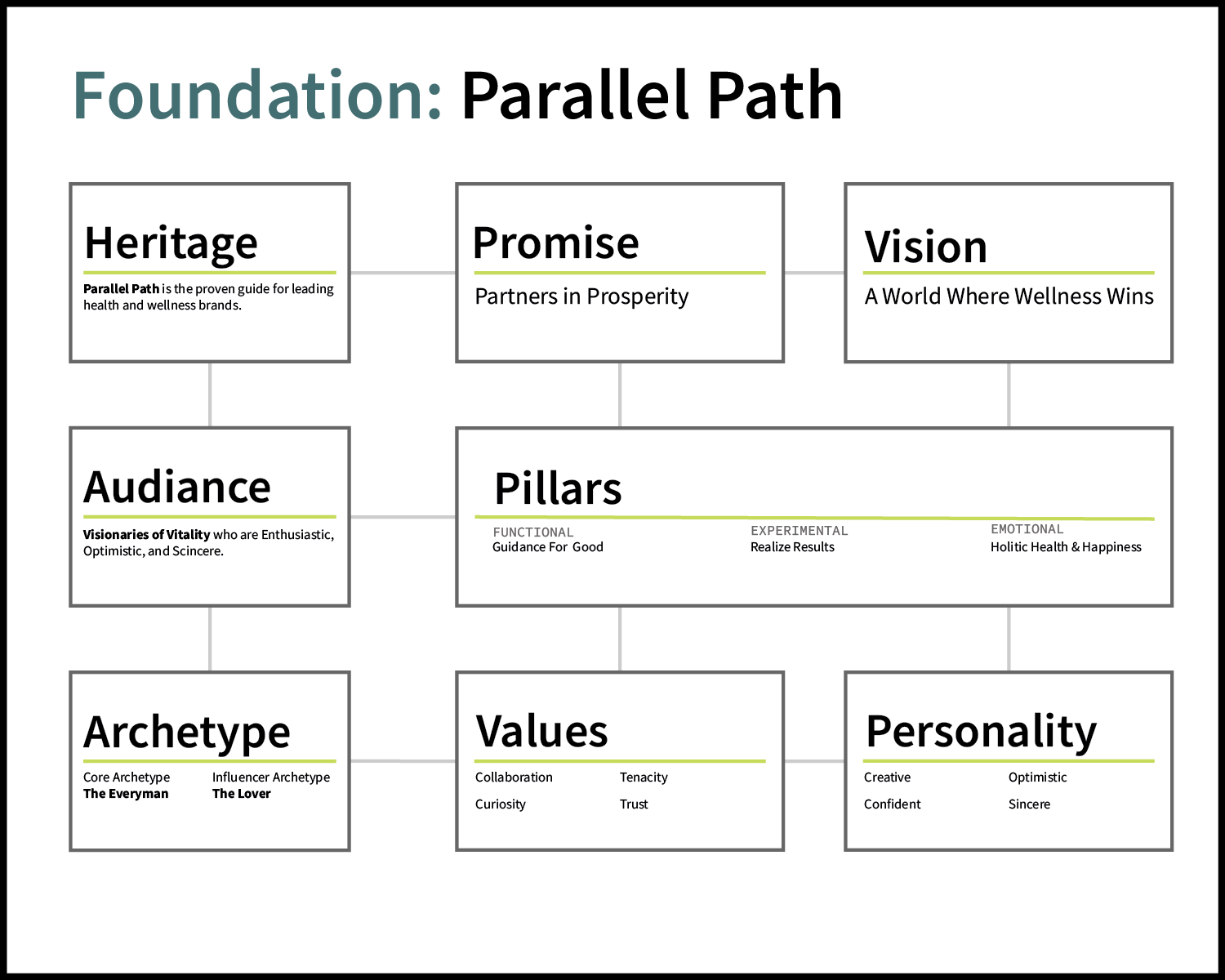
Brand Positioning
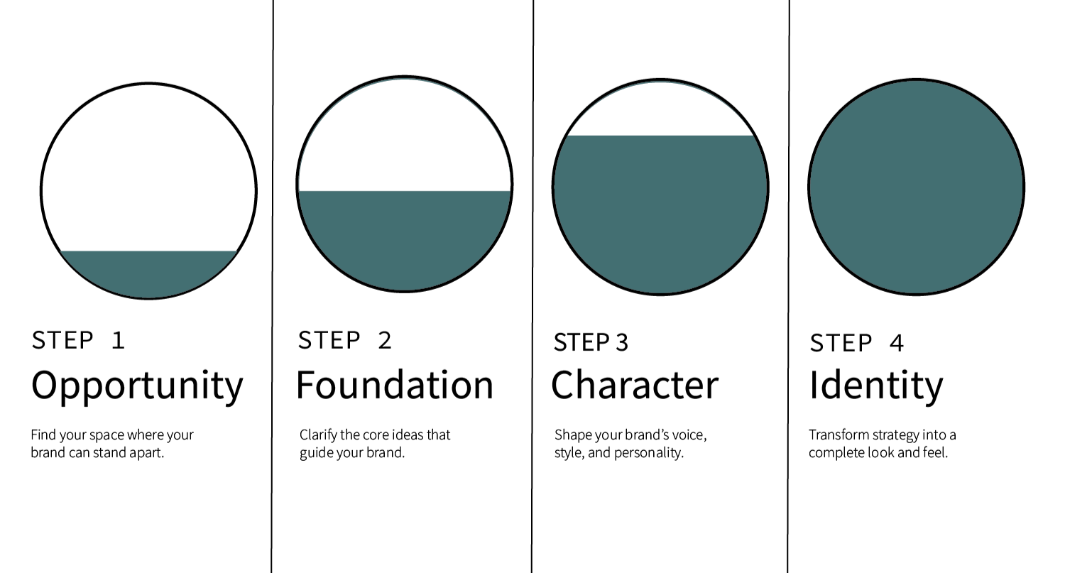
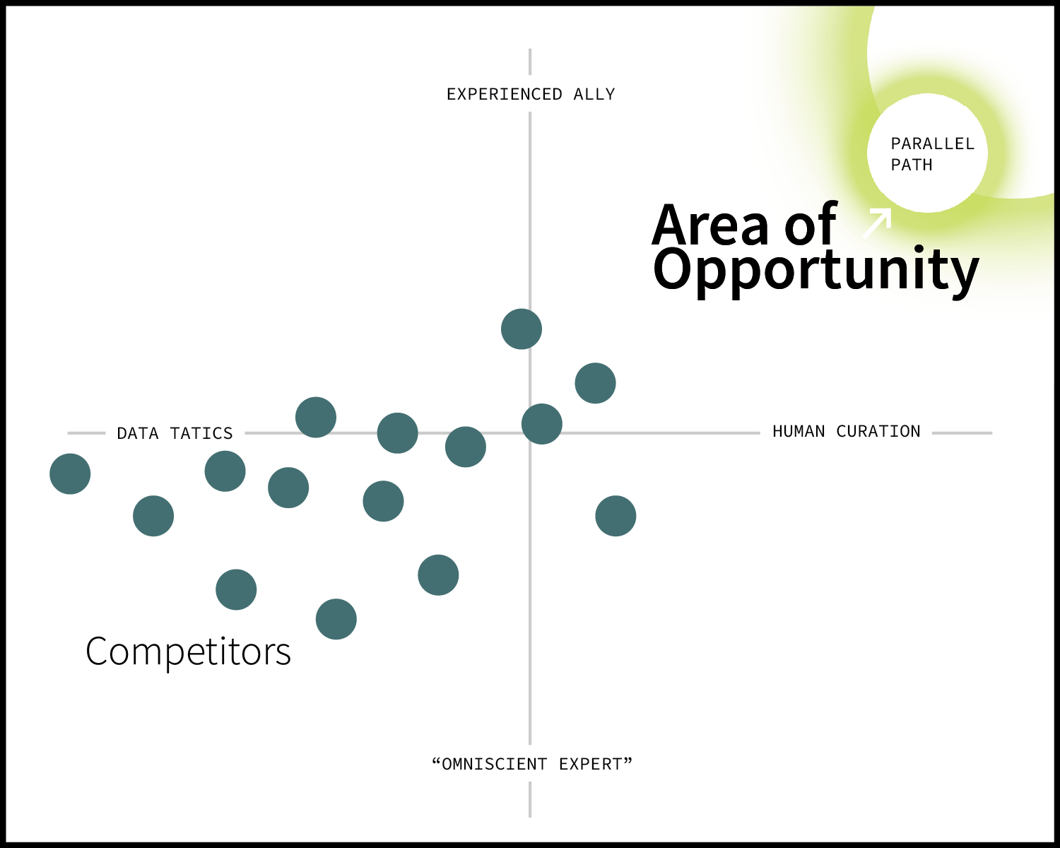
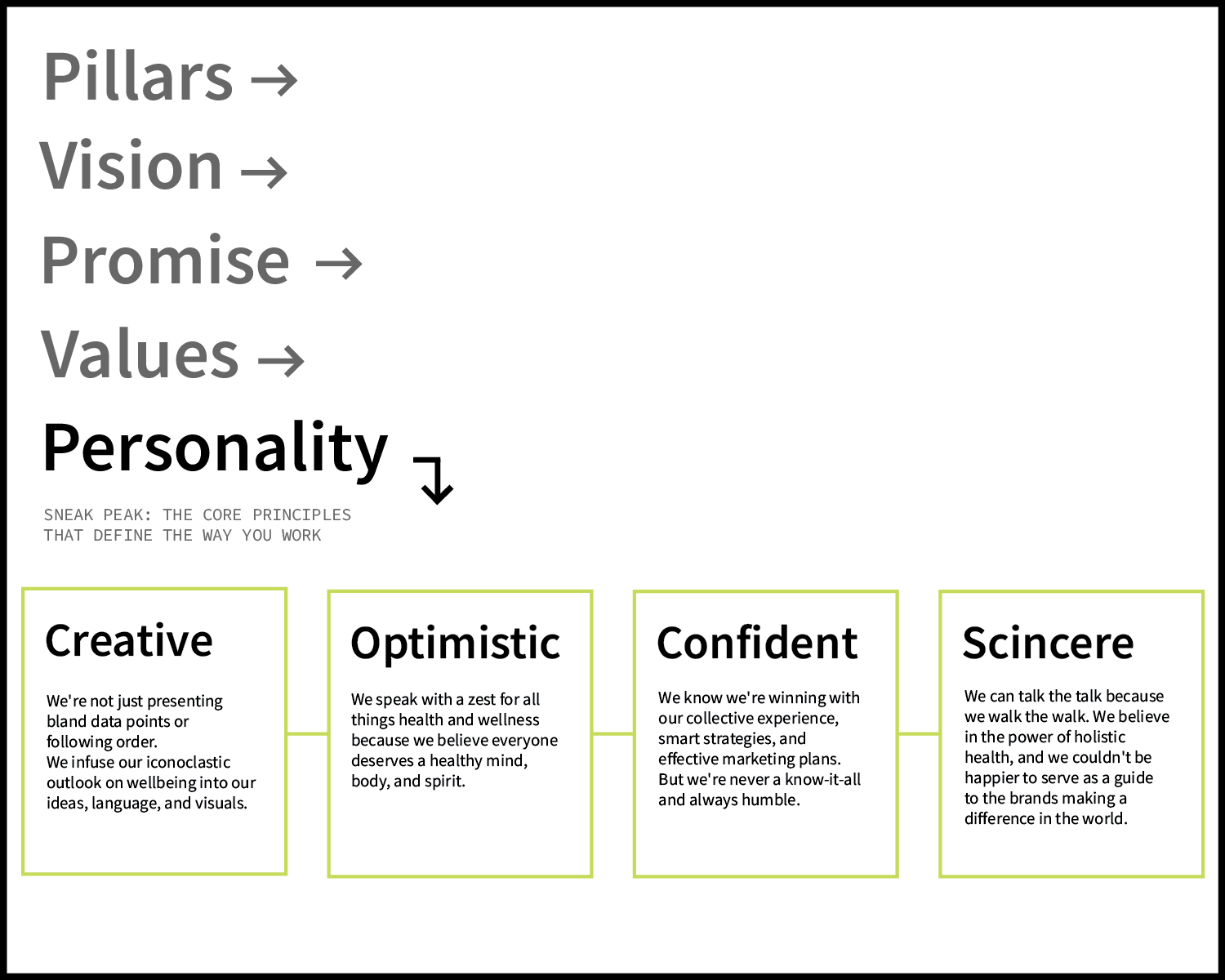
When you're building a brand, strategy isn't a nice-to-have, it’s the entire foundation. That’s why I start every single project by nailing down the brand’s positioning. This is the blueprint that carves out your market niche and pinpoints your competitive advantage. Every brand has a different story to tell, but I use a tried-and-true framework to ensure that every single creative choice we make is intentional and effective.
Visual Identity System
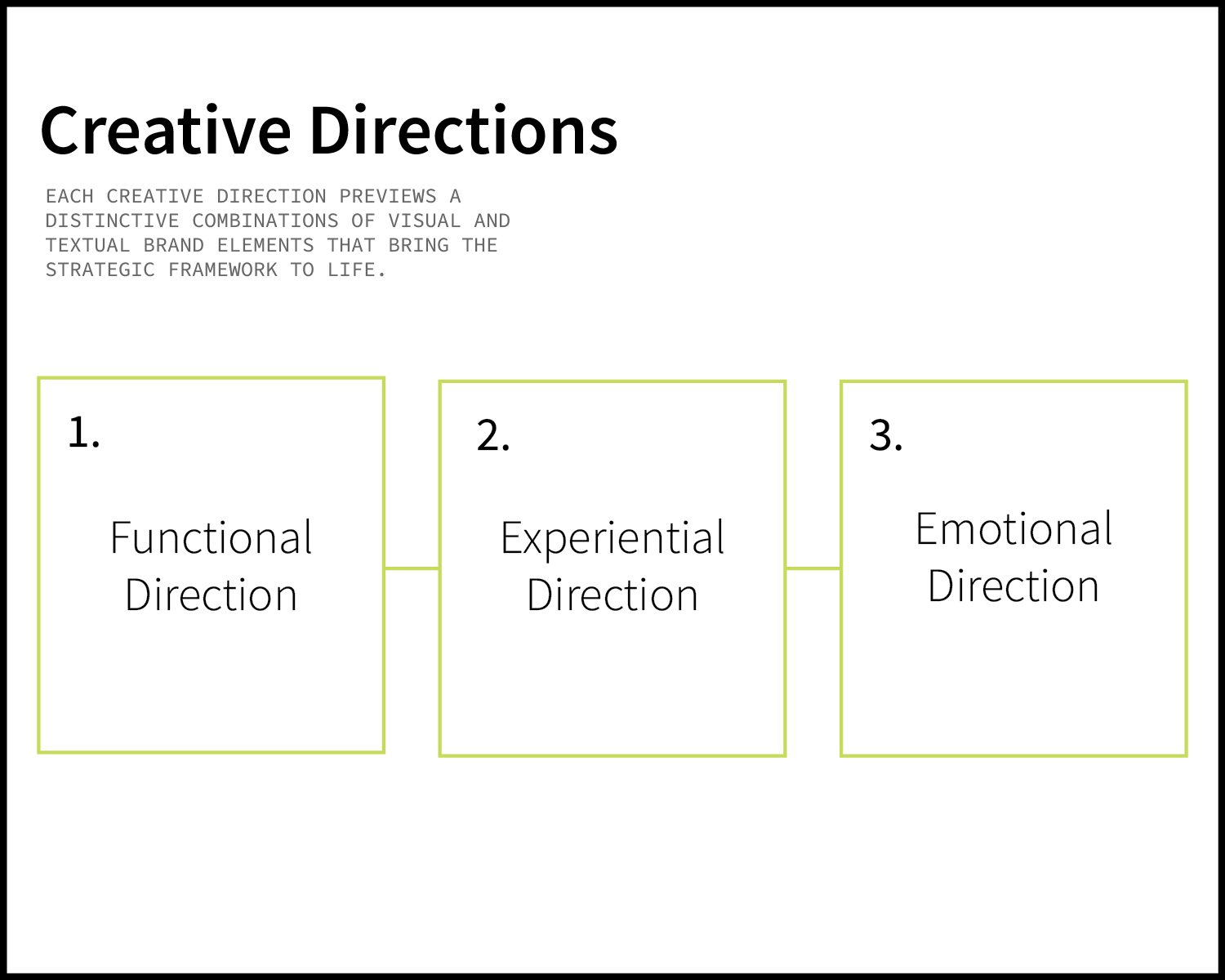
A visual identity system is way more than just a clean design and a few nice colors. It’s the strategic heartbeat of their brand. Parallel Path is driven by a powerful vision and strong values. I translated these intangible assets into a tangible, resonant brand ecosystem. These tools ensure that whether someone is scrolling their feed, opening an email, or walking through the front door, the experience feels uniquely and unmistakably Parallel Path.
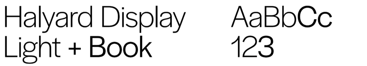
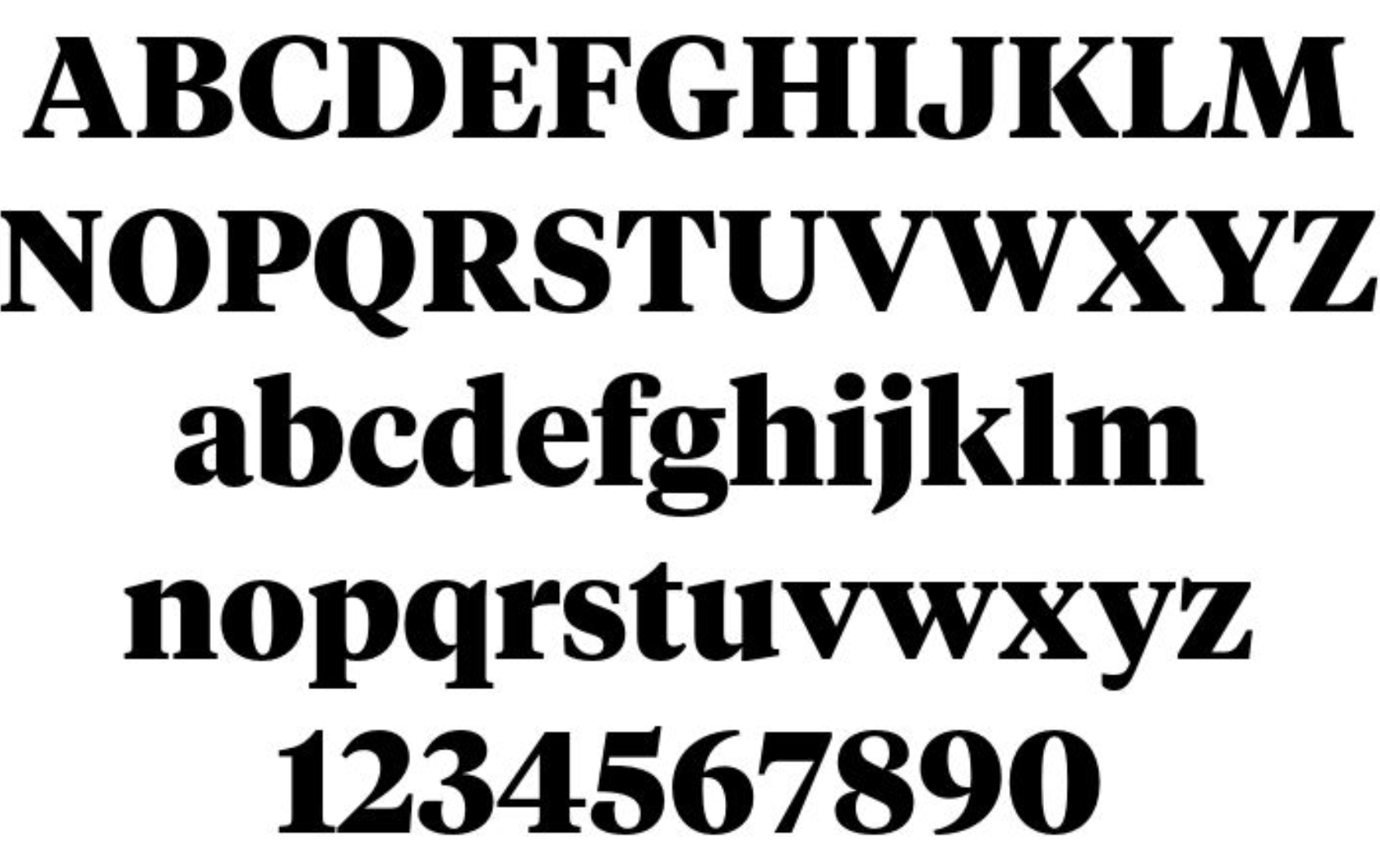
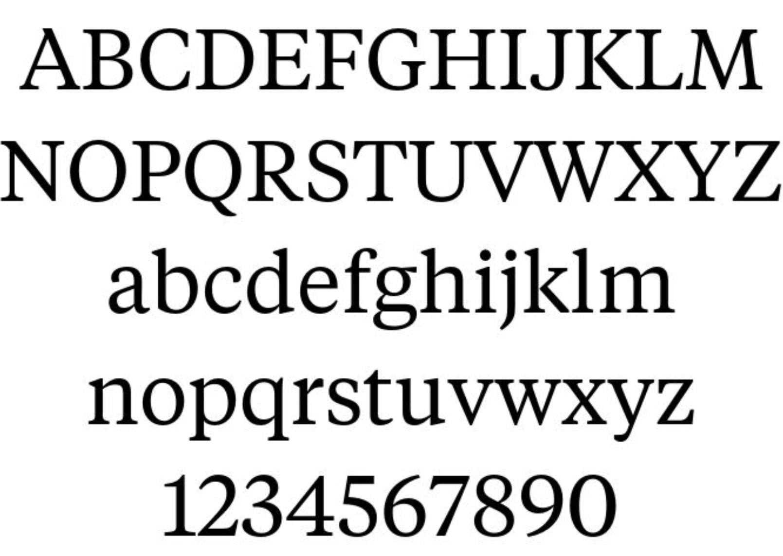
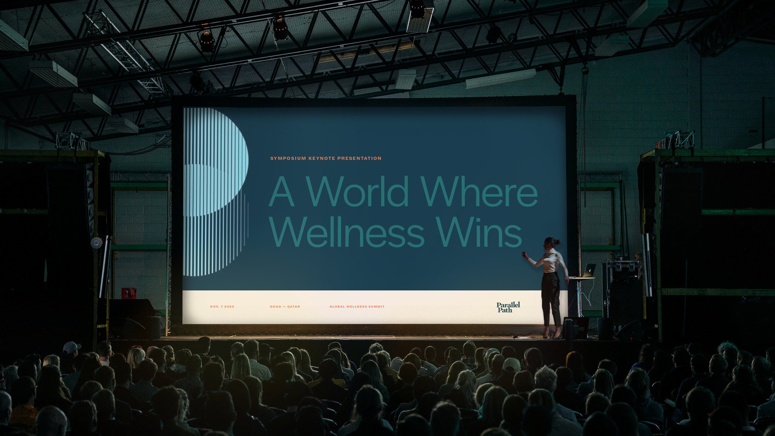
Typography is the visual voice of your brand; it's a strategic tool that builds trust and recognition. The fonts we chose demonstrate a deliberate balance between clinical credibility and human warmth. By pairing a crisp, highly functional sans-serif with a sophisticated, high-contrast serif, you are conveying a dual narrative: scientific clarity meets aspirational lifestyle. Beyond the feeling it conveys, typography also helps organize information. A proper typographic hierarchy dictates exactly how consumers navigate your information, ensuring they digest what matters most.
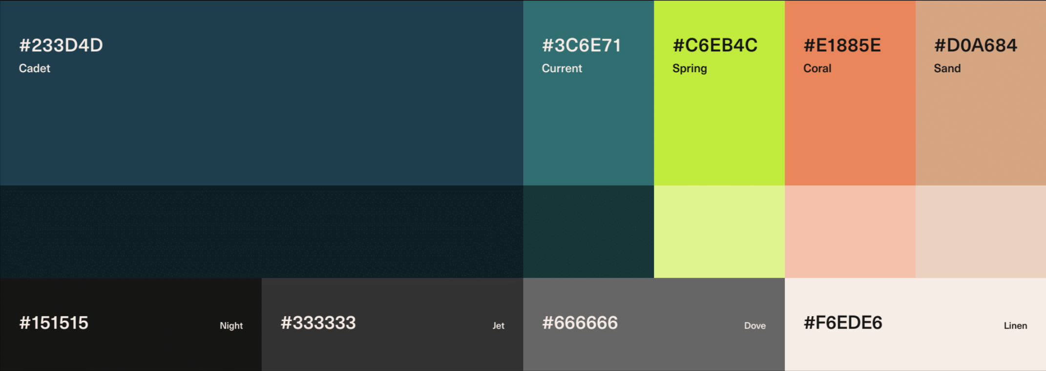
This color palette moves away from the tired, clinical all-white-and-blue standard aesthetic and instead opts for a sophisticated, high-energy look that bridges the gap between biological science and modern lifestyle.
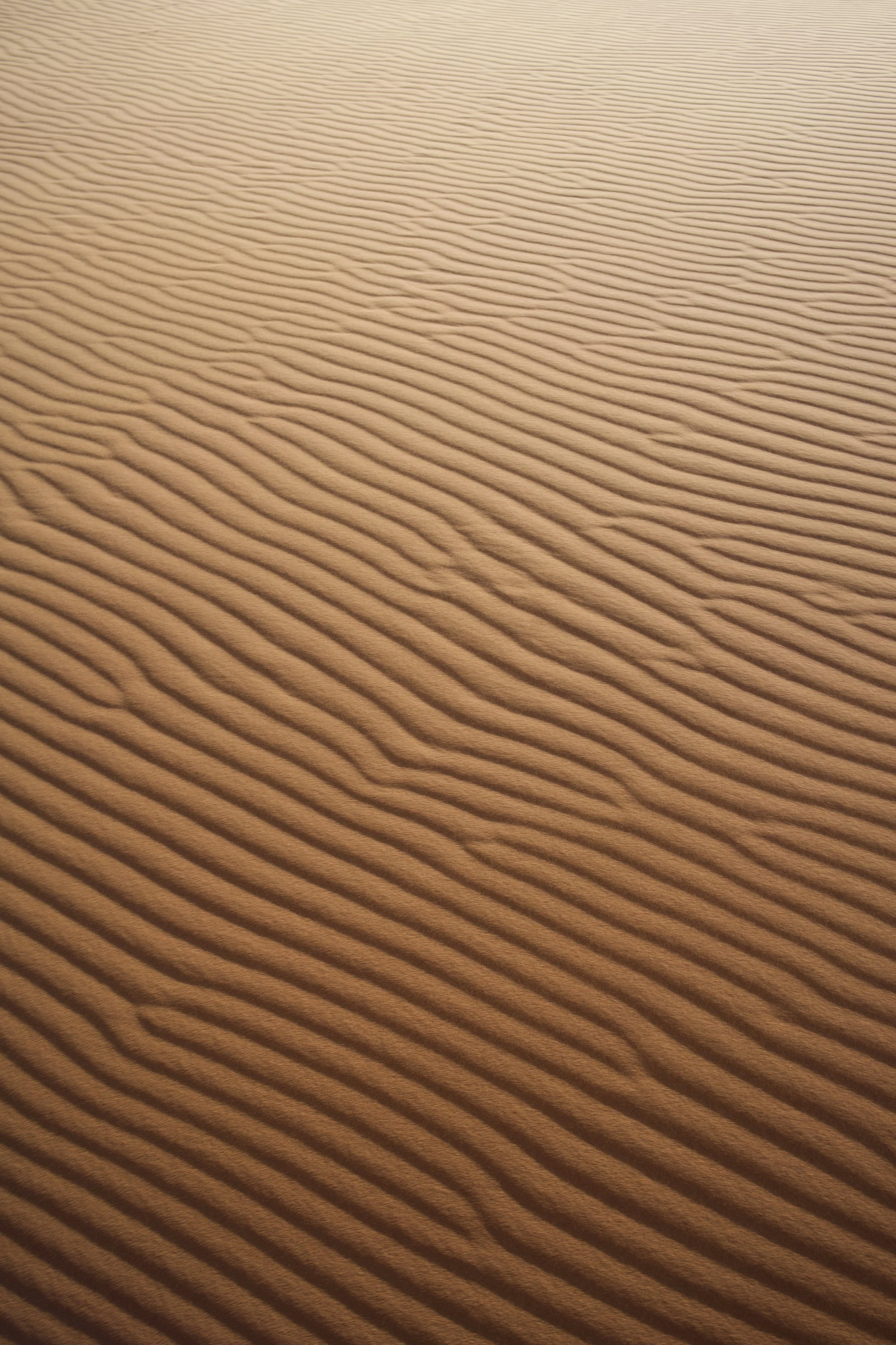
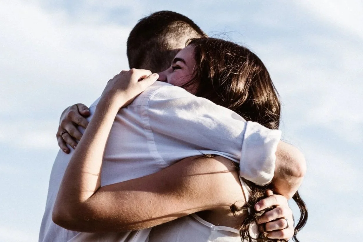
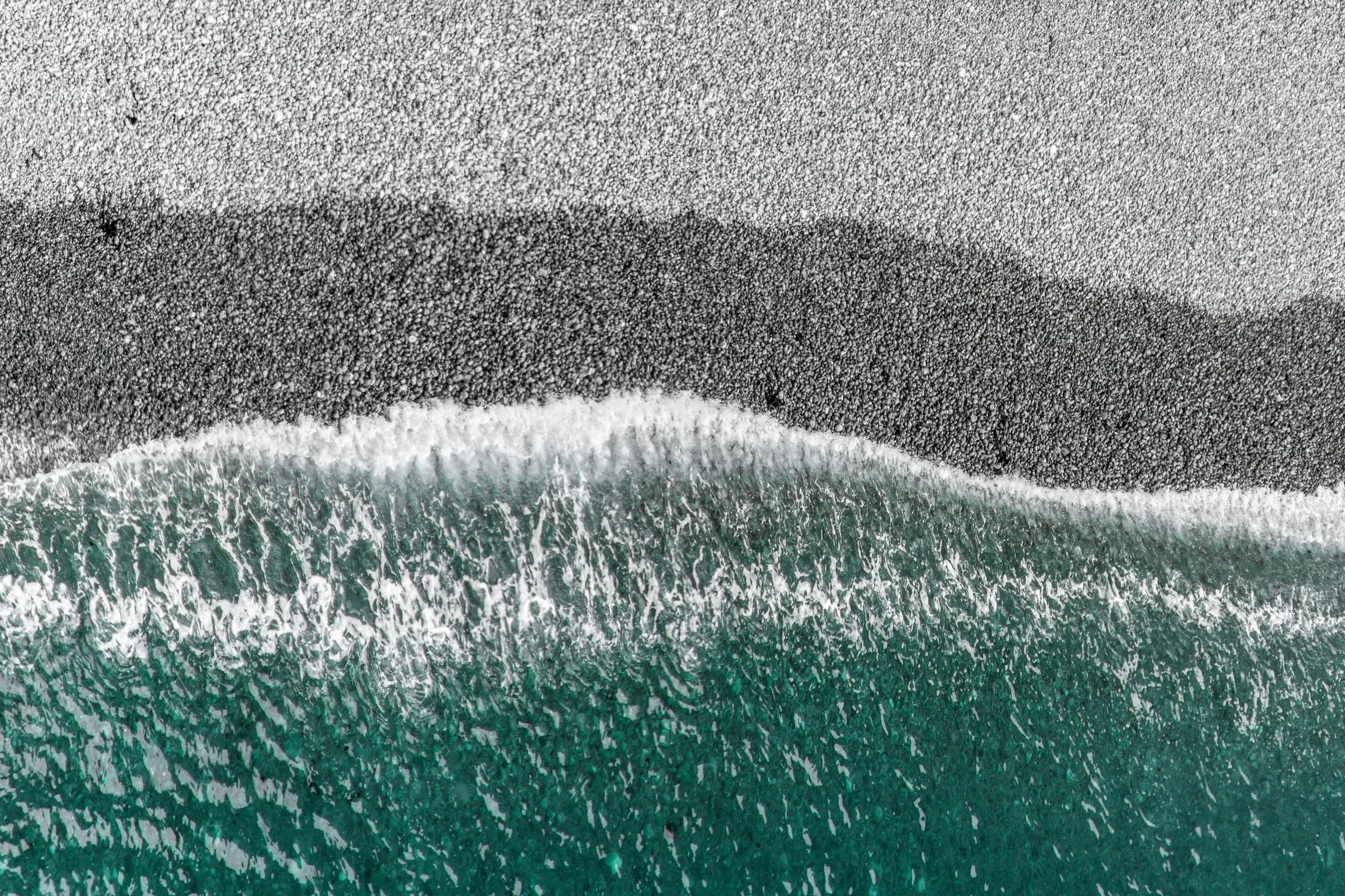
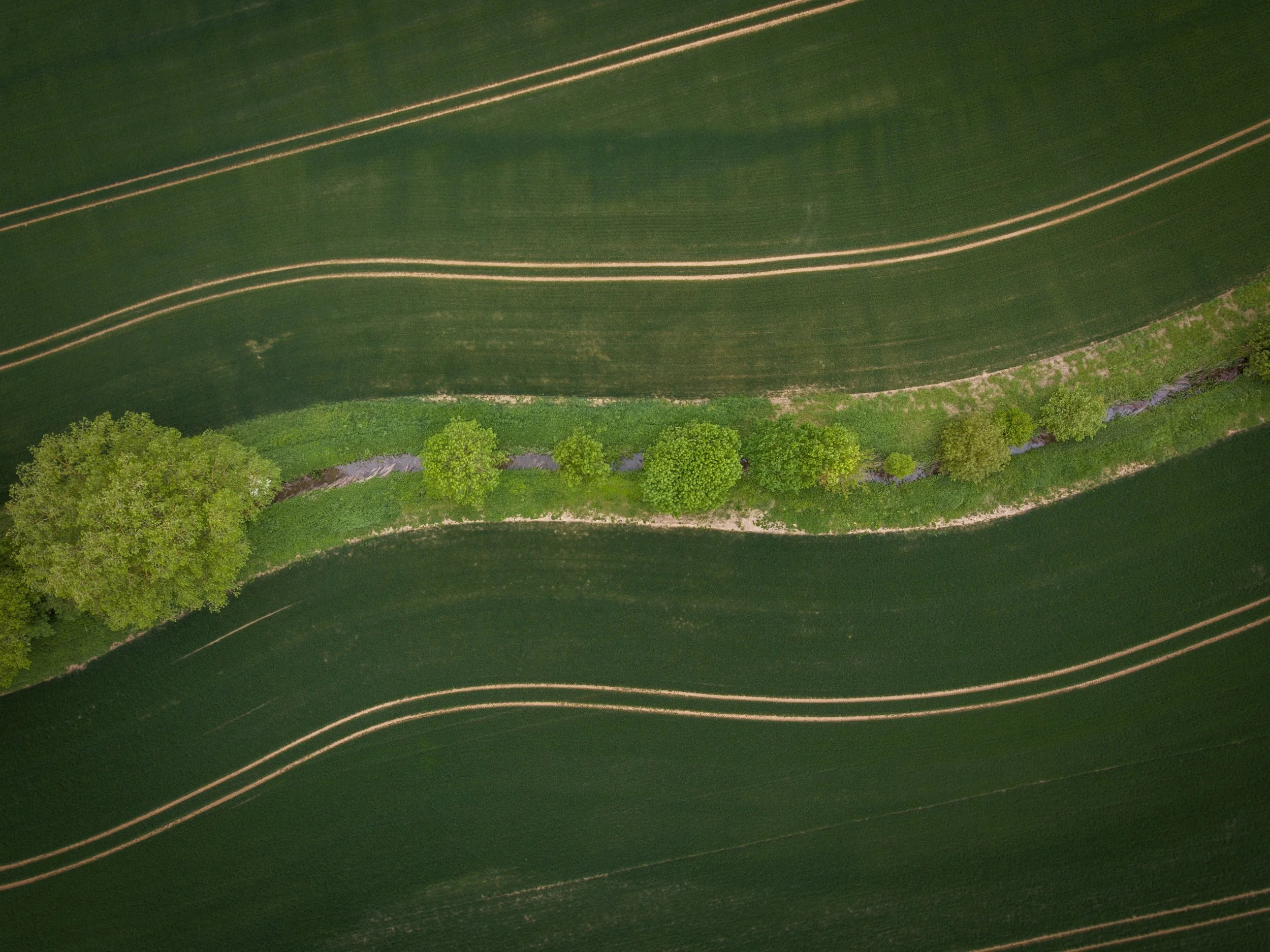
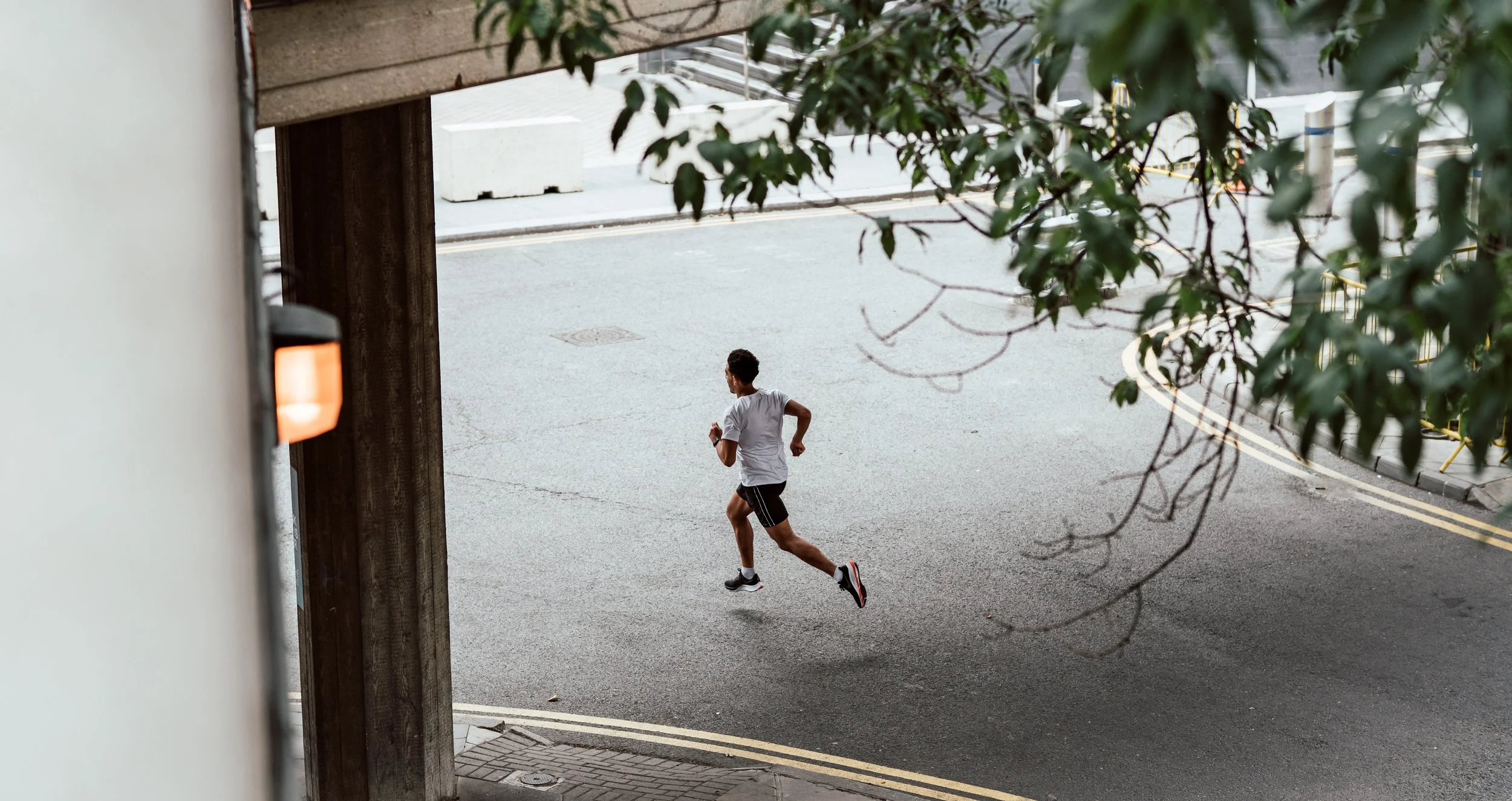
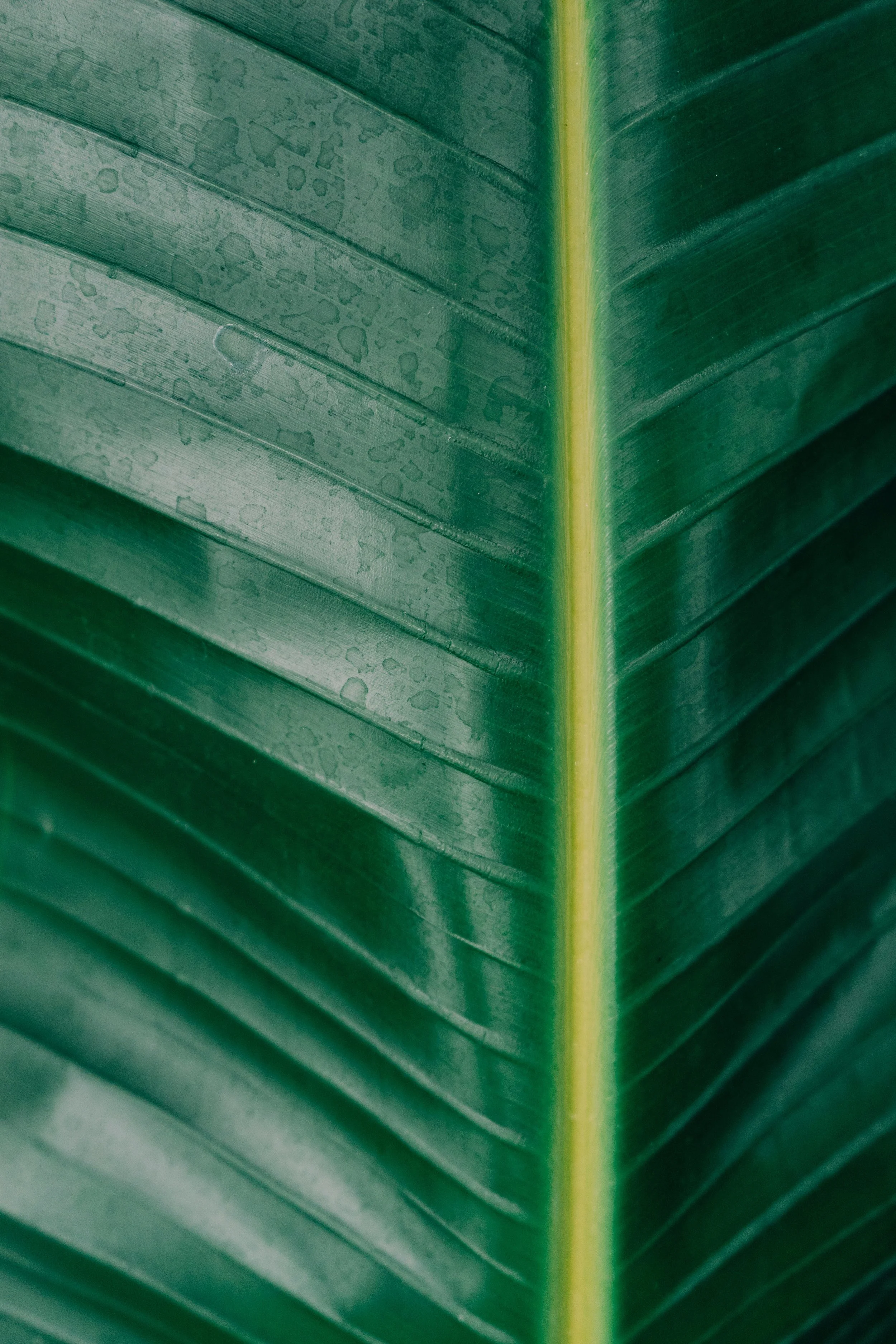
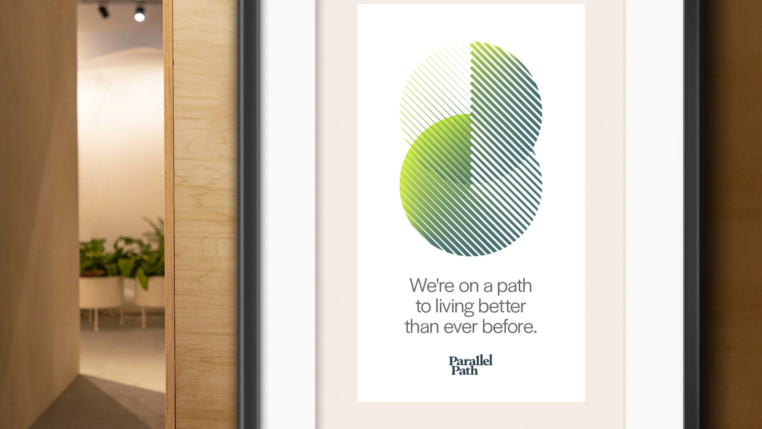
Imagery, featuring natural settings that evoke pathways and motion, uses aerial shots and macro close-ups. As well as human imagery through carefully cropped compositions of wellness activities and intimate interactions.
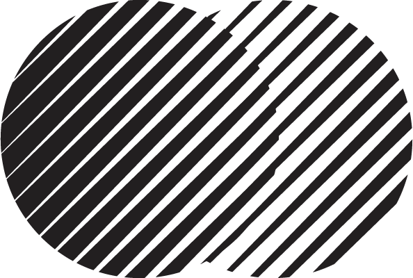
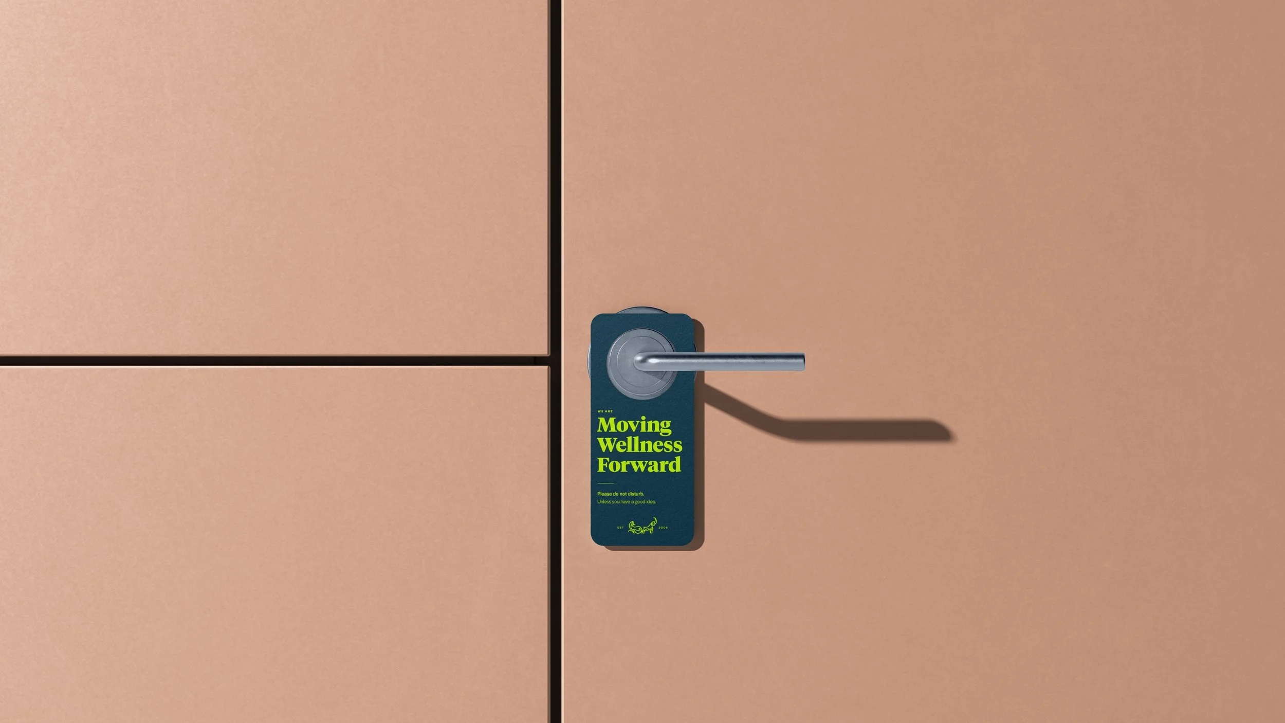
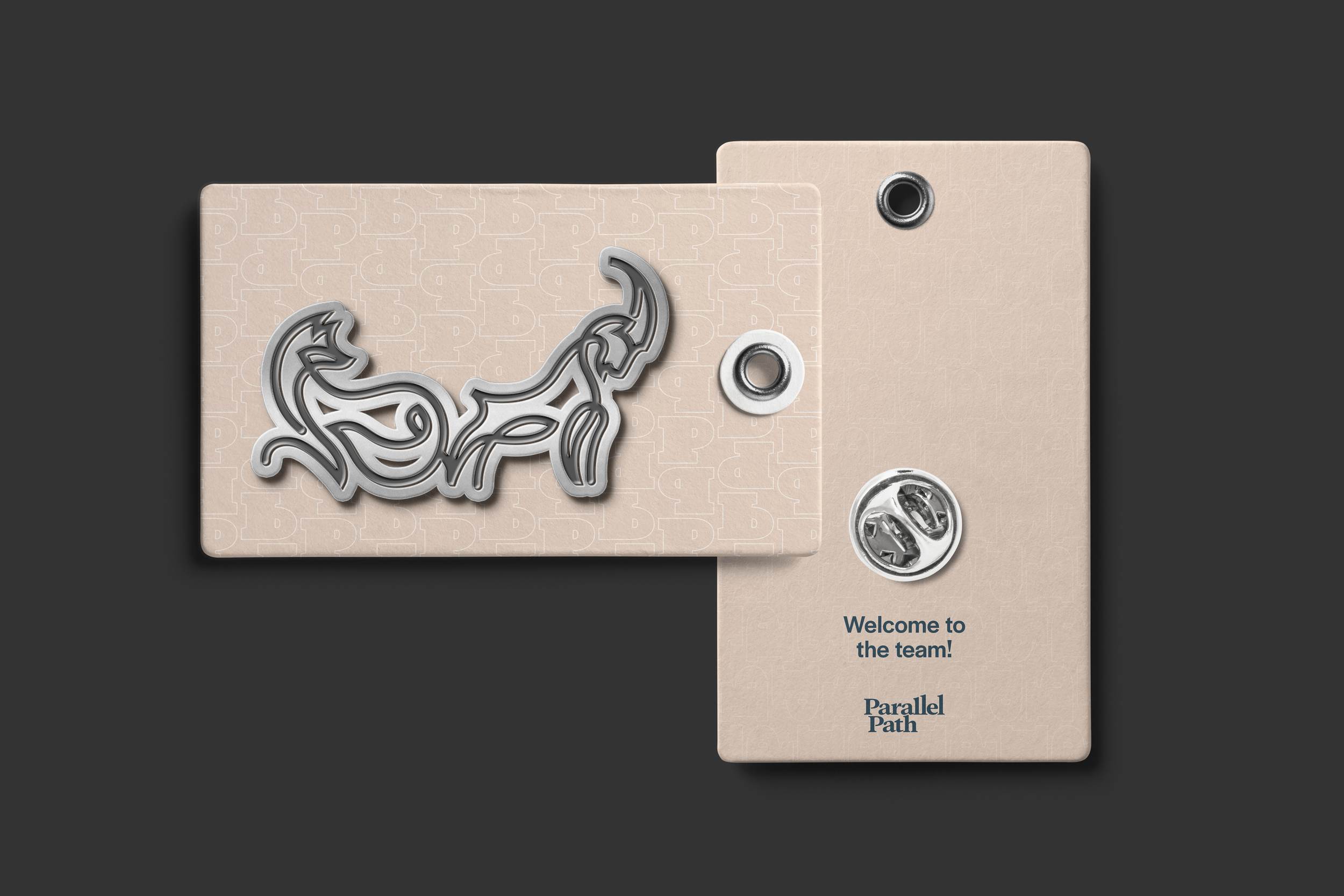
Spirit animals: The mountain goat and fox spirit animals represent the organization's twin disciplines, leadership and forward momentum, and curiosity and guile. made by one single line- one shared path.
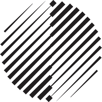
Abstract graphic shapes: Circles made of linear forms- paths that overlap, combine, and add to one another to form something new.
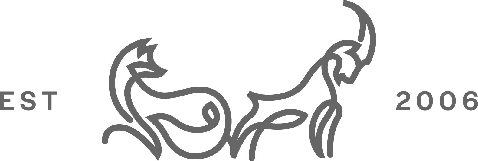
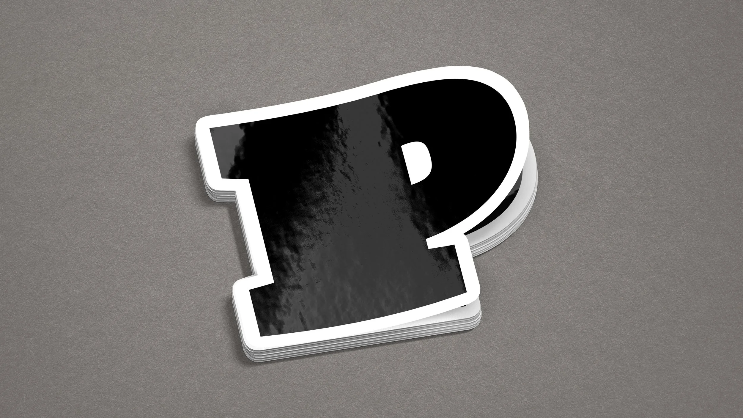
Logo Design
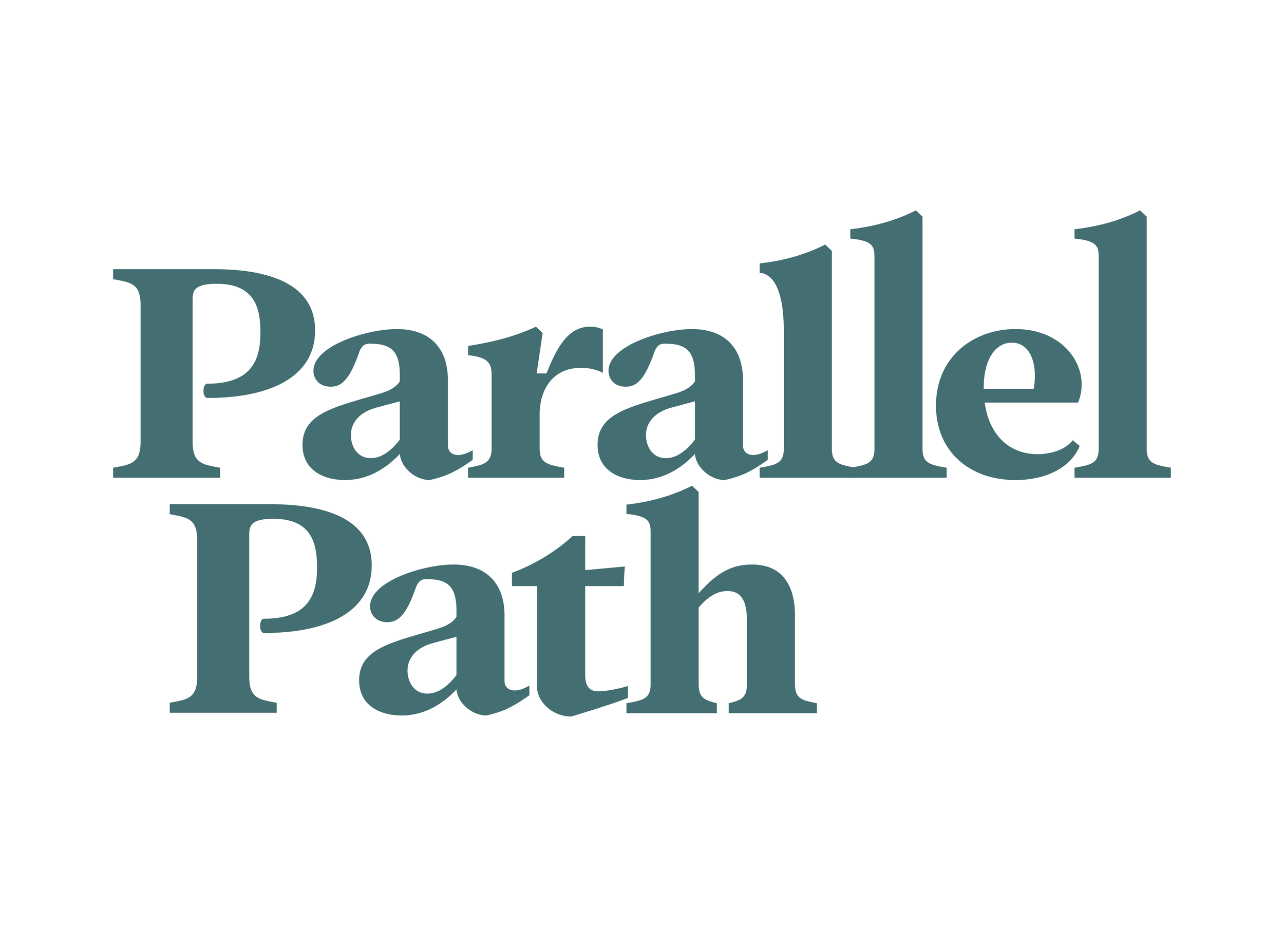
Brand mark: Made with thoughtful symbolic choices. constructed with a graceful and capable humanistic serif typeface. The rising L height reflects their dedication to achieving results. The stacked words in the Brand mark fit together intentionally, reflecting their devotion to collaboration.
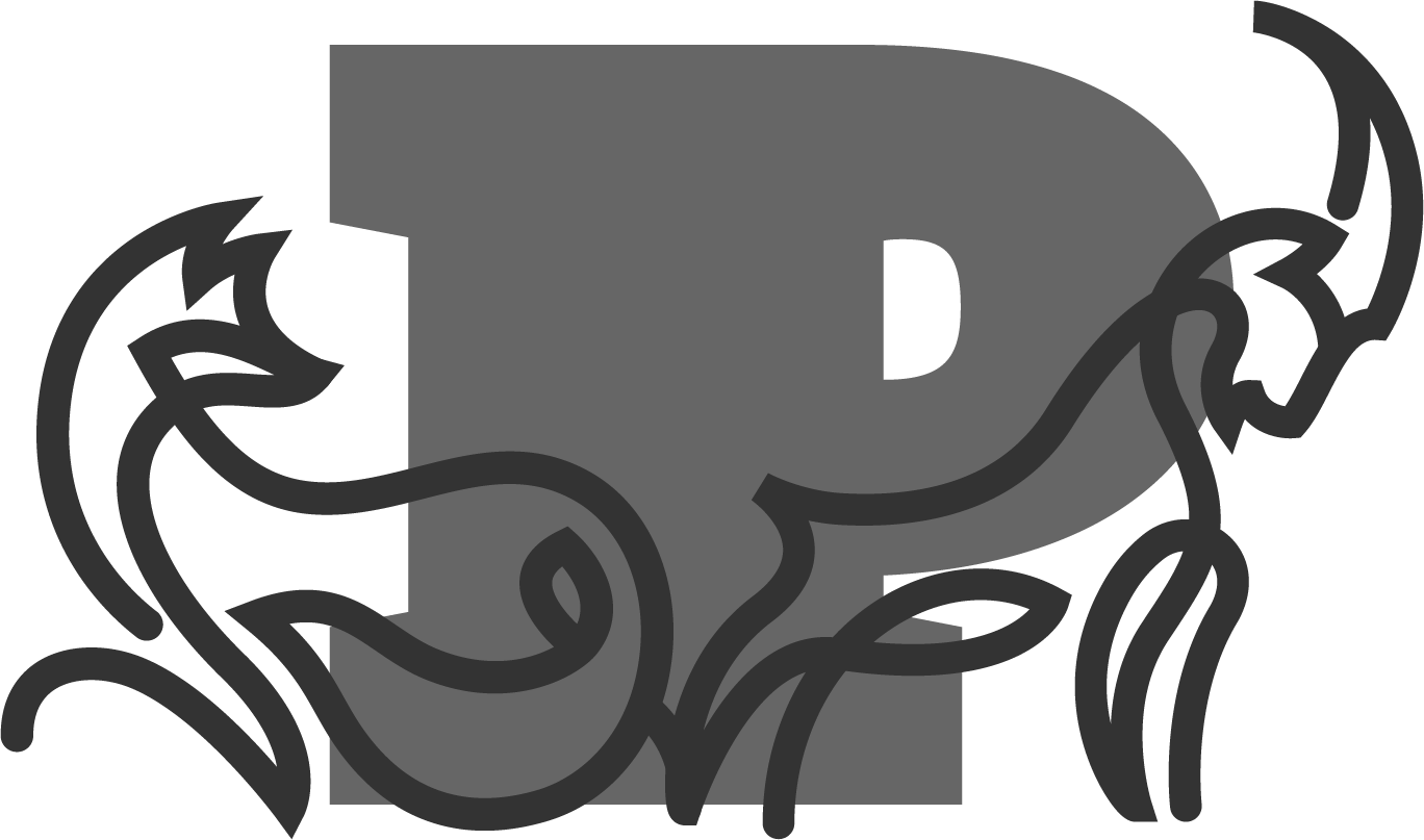
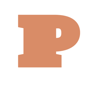
Badge: Extruded letterform icon that is used to represent the brand, in a smaller format. This is useful when the full brand name is unnecessary.
Copywriting and Brand Messaging
When you lock in a consistent brand voice, your messaging becomes more than just relaying information; it becomes a personality.
The people at Parallel Path are experts in health and wellness, and they needed a way to convey their knowledge in a friendly, easy-to-understand, and engaging format. This relaxed and mindful language makes their brand easily recognizable and helps build trust with clients.
“The writing you did really helps us define who we are without having to have some mission statement that we regurgitate on every single deck .”
- Senior Director: Amanda Williams
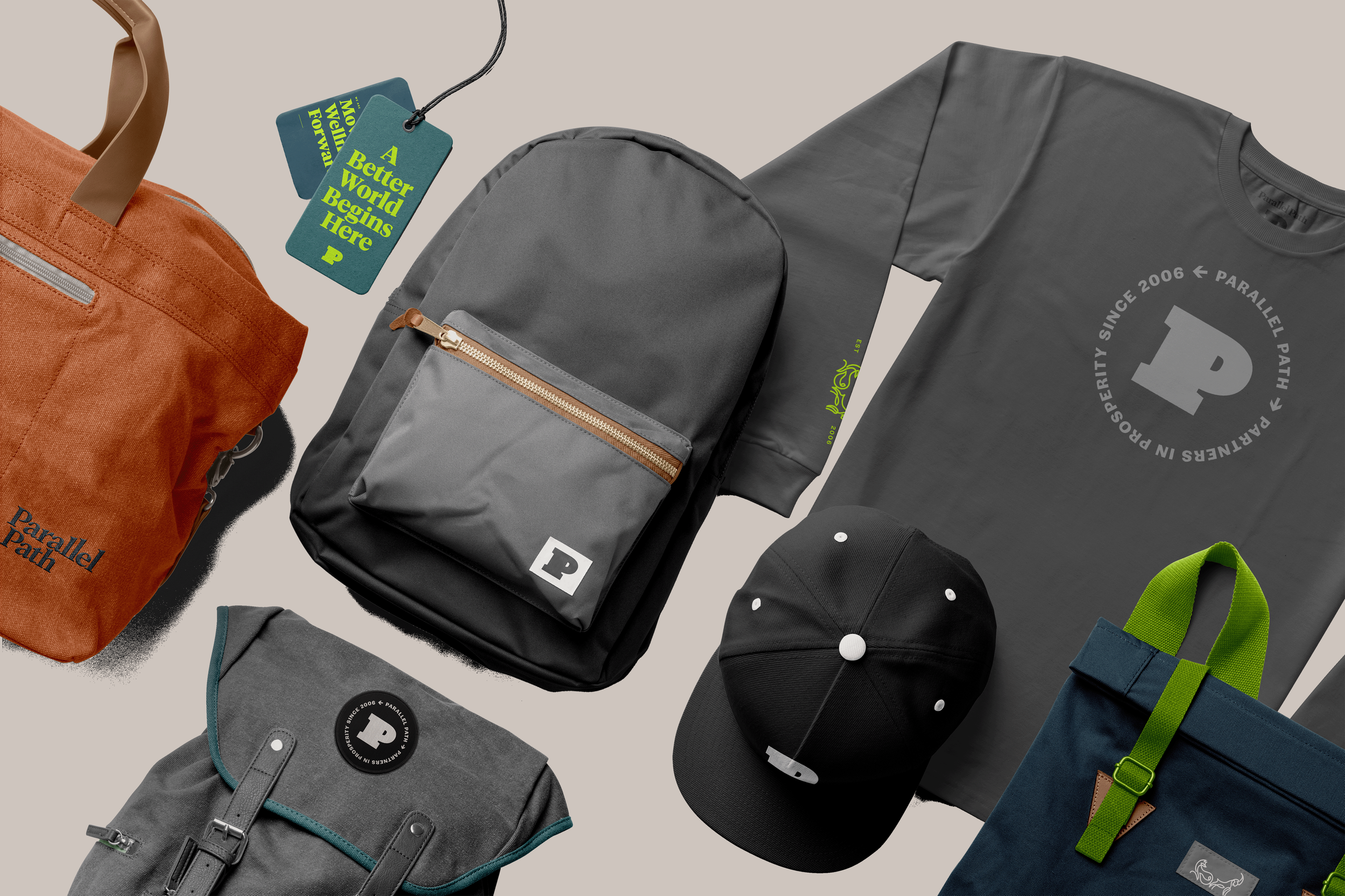
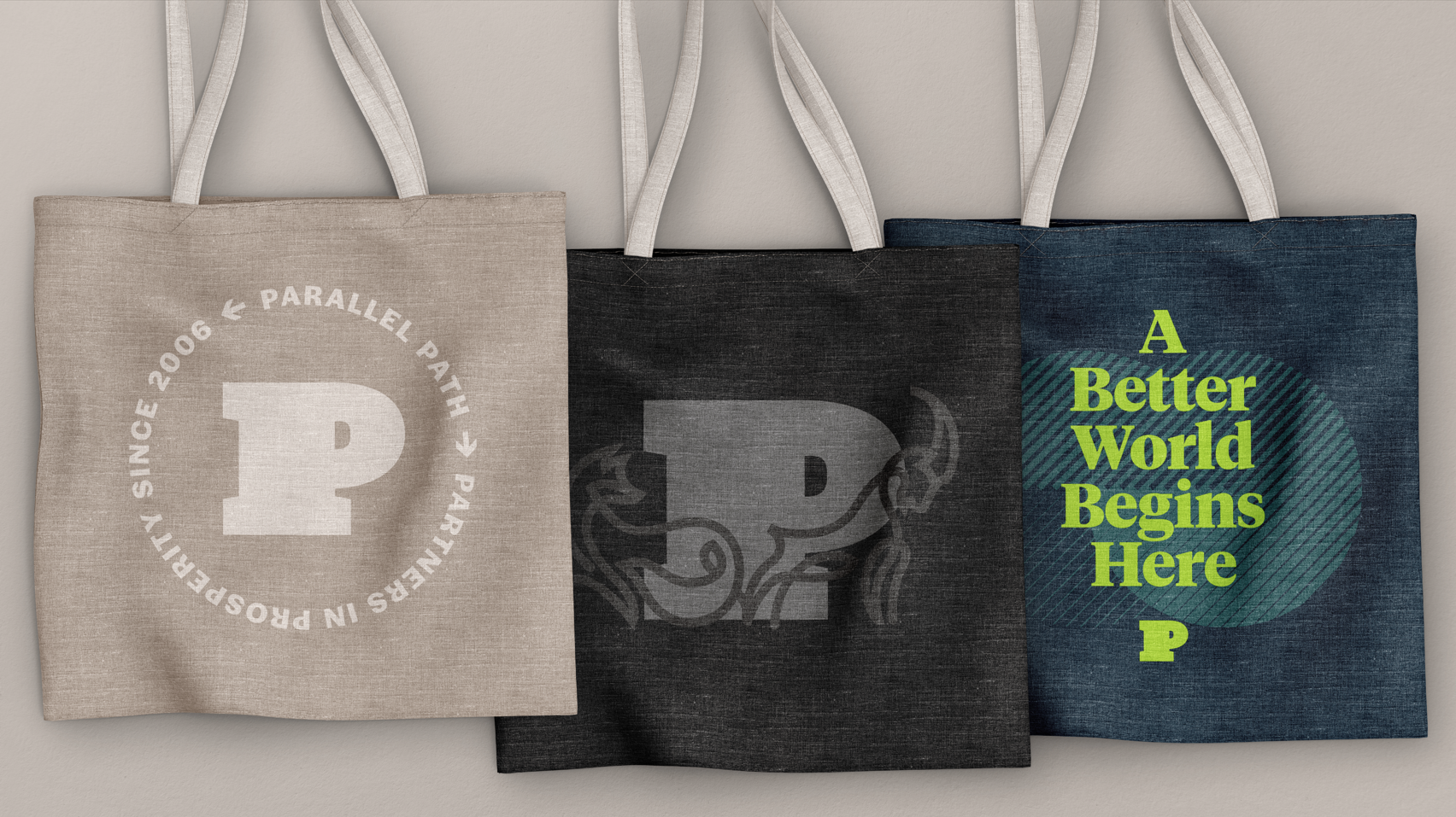
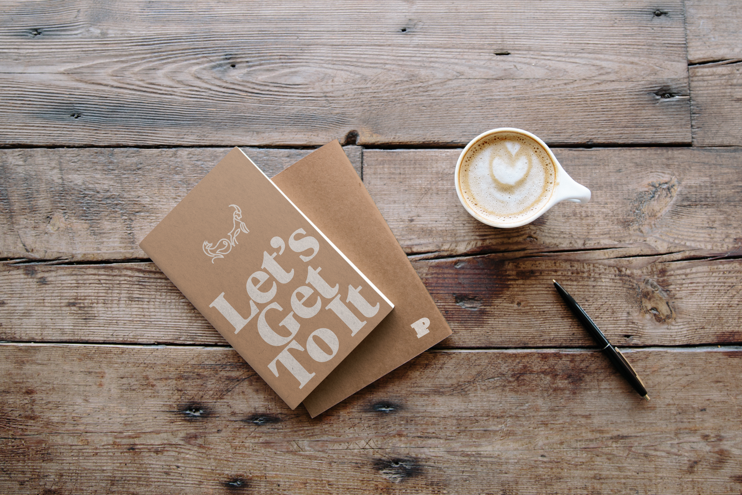
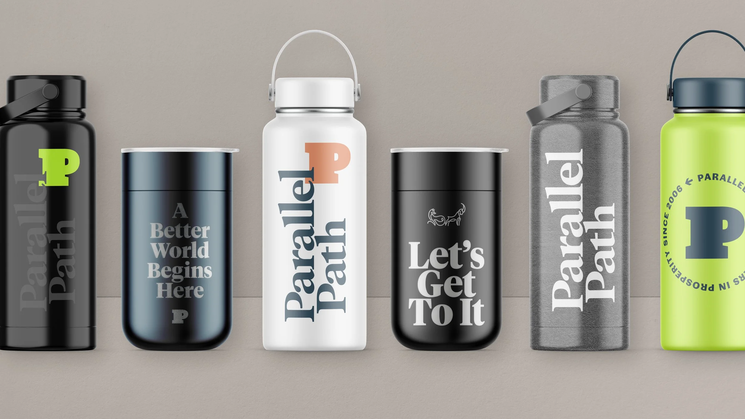
Merchendise Designs
Premium gear is one of the easiest ways to weave your brand into people’s day-to-day lives. For Parallel Path, the goal wasn’t just to print a logo; it was to create merchandise that inspires.
I designed a collection of high-quality, intentional products. The result? An elevated brand experience that builds genuine customer loyalty, attracts new talent, and gives the internal team a well-deserved dose of company pride.
“This really gives us enough breath to evolve and lean into the different areas that you’ve shown, so that our brand stays fresh.”
- Senior Director: Amanda Williams
“I think if we were at a conference with this [branding material], people would stop to hear about it.”
-Chief Executive Officer: John Kadlic